Caleb Torres

Thank you for showing interest in my work. This page is for showcasing my work in a range of disciplines such as data analysis, mathematics and philosophy, as well as other fields I find interesting. Some of these projects have been the result of collaboration, while others reflect academic coursework, and even others stem from side projects I complete with any free time I have.
I am recent graduate in mathematics, philosophy and computer science. I enjoy learning about the intersection between mathematical fields such as topology and geometry and their applications in data analysis. I also enjoy investigating philosphical questions in metaphysics, AI and language. Feel free to contact me at torrescaleb385@gmail.com.
View My LinkedIn Profile
A Brief Walkthrough of Persistance Diagram and Image Applicatons to Image Data
Project description: The discipline of Topology is broadly concerned with the notions of continuity, “conectedness” and “closeness” of geometric objects and their structure. When we seek to understand the global features of data, and we observe that the data in question has a geometric semblance, we can apply topological concepts to determine any important features of the data. In this brief walkthrough I will demonstrate how we apply topological methods and concepts to grasp the global features of image data.
1. Why Image Data?
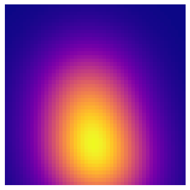
Image processing and recognition are important capabilities in machine learning. One particular problem involves identifying any distinct global components or features of a given image. It might be beneficial for a program to percieve the global features of an image as a preliminary step to further processing. Through topological data analysis (TDA) We hope to define procedures which address this task. Take the following image.

We clearly percieve certain geometric qualities in the image. Globally, the image is radially gradient and symmetric. The question is how we proceed to identify these features and ultimately produce a summary. With TDA, we can leverage the concepts of persistant homology to impose a structure on the data that will show us what features are persistant and what features are due to noise. Without discussing the theoretical foundations of TDA, we can assume that if our data has significant goemetric features, then our imposed structure will register them accordingly.
2. Data Pipeline
First, we identify how we will prepare our image data. For that, we will rely heavily on Pillow to handle image parsing. Then, we will need some visualization libraries, data handling libraries and finally our TDA libraries. I will highlight each library as we go along.
from PIL import Image
import numpy as np
import pandas as pd
import itertools
import matplotlib.pyplot as plt
from mpl_toolkits import mplot3d
from mpl_toolkits.mplot3d import Axes3D
from matplotlib import cm
from matplotlib.ticker import LinearLocator, FormatStrFormatter
from ripser import ripser
from ripser import Rips
from persim import plot_diagrams
import sys
Using Pillow, we load our image and transform the resulting numpy array into a dataframe using itertools. We transform the image into a dataframe for future ease in visualization.
# loading and showing imagee
image = Image.open("test_images/small_gradient_circle.png")
image.show(image)

# create numpy array
image_array = np.array(image)
print(image_array)

# represents dimension of array as an n-tuple.
#Dimensions of array should match image dimensions.
print(image_array.shape)
The ouput is a 50x50 dimensional array that presents us with the rgb grayscale value of the pixel at the given ‘coordinate.’
Next, we restructure our image data into a more friendly pandas dataframe. First, we treat the rgb values and organize them into one column labeled ‘rgb_val.’
value_list = []
for array in image_array:
    for value in array:
            value_list.append(value)
print(value_list)
This gives each rgb value from the ‘start’ of the image to its ‘end.’ Then we transfer the list of rgb values into a column of our dataframe.
newimage_df = pd.DataFrame({'rgb_val': value_list})
print(newimage_df)
                rgb_val
      0         177
      1         174
      2         170
      3         167
      4         163
      ...       ...
      2495      162
      2496      165
      2497      169
      2498      172
      2499      176

      [2500 rows x 1 columns]
Plotting the dataframe with only the ‘rgb_val’ column populated we get an interesting representation of our image.
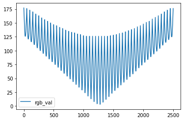
We see the rgb variation as a function of each pixel. We see that some rows of pixels vary between a smaller set of rgb values, while other rows traverse a wide set of rgb values. These wide traversals stand for rows of pixels that are closer to the middle of the image where the gradient is more pronounced.
Next, we also want to express our pixels as (x,y) coordiantes, since we observe that the position of our pixels are relevant to their color.
We do this by carefully considering how we wish to fit a coordinate system on our image.
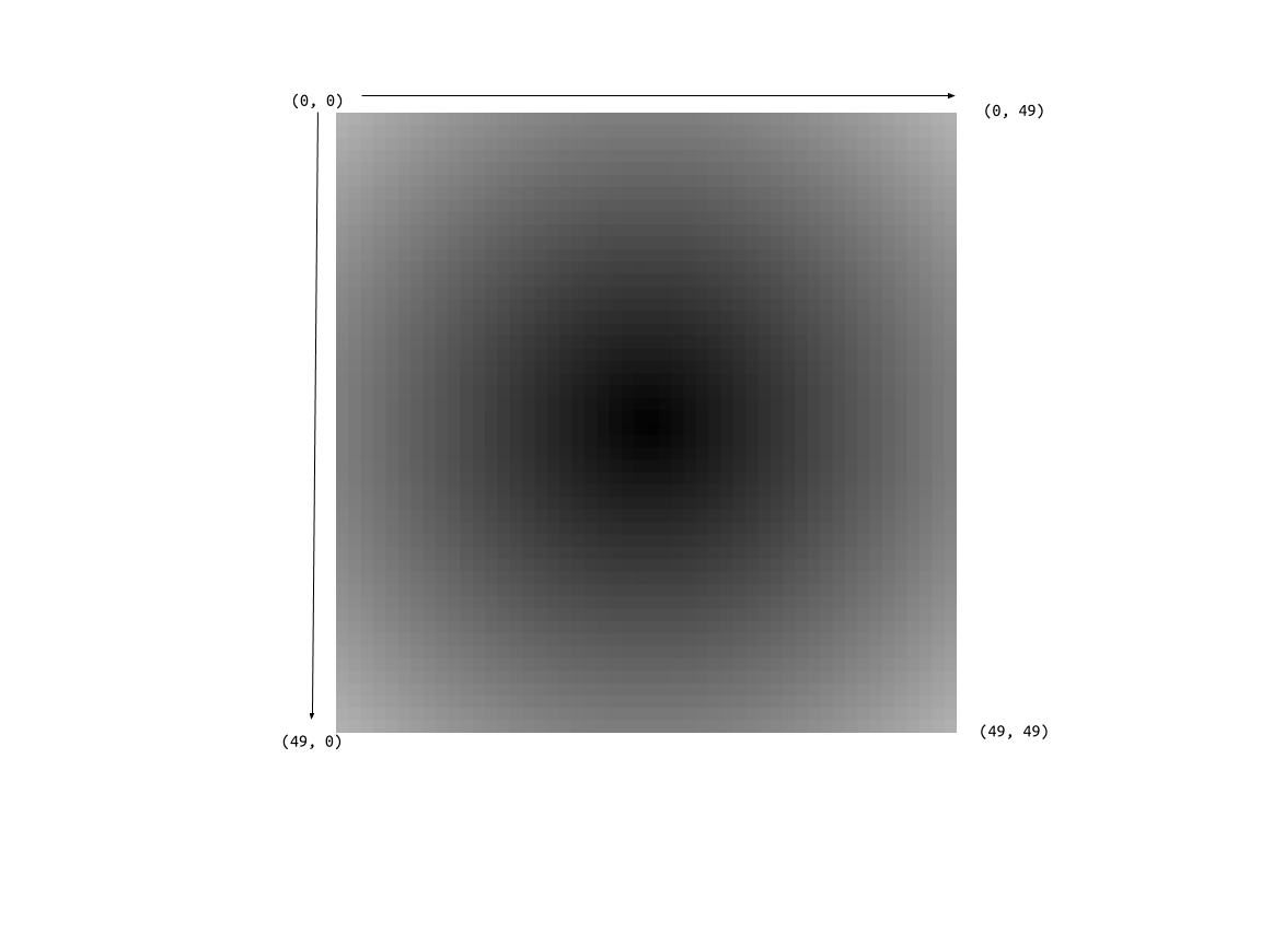
The preceding image defines our coordinate system where the ‘origin’ of the image begins at the top-most and left-most pixel, traversing to the bottom-most and right-most pixel. The following code integrates this coordinate system to our dataframe.
list_of_lists = []

# append 50 empty lists to list_of_lists
for i in range (50):
    list_of_lists.append([])

# insert repeat objects for each list in list_of_lists
for list in list_of_lists:
    list.append(itertools.repeat(list_of_lists.index(list), 50))

# intialize each repeat object to repeat a certain integer 50 times
final_list = []
for list in list_of_lists:
    for value in list:
            final_list.append(value)

print(final_list)
[repeat(0, 50), repeat(1, 50), repeat(2, 50), repeat(3, 50), repeat(4, 50), repeat(5, 50), repeat(6, 50),
repeat(7, 50), repeat(8, 50), repeat(9, 50), repeat(10, 50), repeat(11, 50), repeat(12, 50), repeat(13, 50),
repeat(14, 50), repeat(15, 50), repeat(16, 50), repeat(17, 50), repeat(18, 50), repeat(19, 50), repeat(20, 50),
repeat(21, 50), repeat(22, 50), repeat(23, 50), repeat(24, 50), repeat(25, 50), repeat(26, 50), repeat(27, 50),
repeat(28, 50), repeat(29, 50), repeat(30, 50),repeat(31, 50), repeat(32, 50), repeat(33, 50), repeat(34, 50), repeat(35, 50), repeat(36, 50),
repeat(37, 50), repeat(38, 50), repeat(39, 50), repeat(40, 50), repeat(41, 50), repeat(42, 50), repeat(43, 50), repeat(44, 50), repeat(45, 50),
repeat(46, 50), repeat(47, 50), repeat(48, 50), repeat(49, 50)]
x_list = []
for repeat_item in final_list:
    for element in repeat_item:
            x_list.append(element)

print(x_list)
[0, 0, 0, 0, 0, 0, 0, 0, 0, 0, 0, 0, 0, 0, 0, 0, 0, 0, 0, 0, 0, 0, 0, 0, 0, 0, 0, 0, 0, 0, 0, 0, 0, 0, 0, 0, 0, 0, 0, 0, 0, 0,
0, 0, 0, 0, 0, 0, 0, 0, .... ,49, 49, 49, 49, 49, 49, 49, 49, 49, 49, 49, 49, 49, 49, 49, 49, 49, 49, 49, 49, 49, 49, 49, 49, 49,
49, 49, 49, 49, 49, 49, 49, 49, 49, 49, 49, 49, 49, 49, 49, 49, 49, 49, 49, 49, 49, 49, 49, 49, 49]
y_kernellist = []

for value in range(50):
    y_kernellist.append(value)

y_list = y_kernellist*50
print(y_list)
[0, 1, 2, 3, 4, 5, 6, 7, 8, 9, 10, 11, 12, 13, 14, 15, 16, 17, 18, 19, 20, 21, 22, 23, 24, 25, 26, 27, 28, 29, 30, 31, 32, 33, 34, 35, 36, 37, 38, 39, 40, 41, 42, 43, 44, 45, 46, 47, 48, 49, ... , 0, 1, 2, 3, 4, 5, 6, 7, 8, 9, 10, 11, 12, 13, 14, 15, 16, 17, 18, 19, 20, 21, 22, 23, 24, 25, 26, 27, 28, 29, 30, 31, 32, 33, 34, 35, 36, 37, 38, 39, 40, 41, 42, 43, 44, 45, 46, 47, 48, 49, 0, 1, 2, 3, 4, 5, 6, 7, 8, 9, 10, 11, 12, 13, 14, 15, 16, 17, 18, 19, 20, 21, 22, 23, 24, 25, 26, 27, 28, 29, 30, 31, 32, 33, 34, 35, 36, 37, 38, 39, 40, 41, 42, 43, 44, 45, 46, 47, 48, 49, 0, 1, 2, 3, 4, 5, 6, 7, 8, 9, 10, 11, 12, 13, 14, 15, 16, 17, 18, 19, 20, 21, 22, 23, 24,
25, 26, 27, 28, 29, 30, 31, 32, 33, 34, 35, 36, 37, 38, 39, 40, 41, 42, 43, 44, 45, 46, 47, 48, 49]
data = {'rgb_vals': value_list, 'x_values': x_list, 'y_values': y_list}

df = pd.DataFrame(data)
df.head()
df.tail()
        rgb_vals    x_values    y_values
    0       177     0           0
    1       174     0           1
    2       170     0           2
    3       167     0           3
    4       163     0           4
    ...     ...     ...         ...
    2495    162     49          45
    2496    165     49          46
    2497    169     49          47
    2498    172     49          48
    2499    176     49          49
Now we have a nice dataframe that organizes our data in coordinate format with accompanying rgb values. Let us now produce a 3-d visualization of our image.
fig = plt.figure()
ax = fig.gca(projection='3d')
ax.plot_trisurf(df['x_values'], df['y_values'], df['rgb_vals'],
                cmap=plt.cm.viridis, linewidth=0.2)

ax.view_init(30, 185)
plt.show()
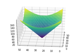
With this plot, we can see how the gradient nature of our image is symmetric with several concentric bands of similarly colored pixels. Where we have pixels of lower rgb value, we see a purple band, then another batch of pixels represented by a blue-green band. Lastly, there are yellow fringes wich represent similar pixels of higher rgb value.
This allows us to determine hueristically how our data is shaped, and how we can measure ‘distance’ between each pixel. Not only is distance reprsented by coordinate distance, but also by color similarity.
Next we compute a persistance diagram on our image data set to see what geometric features are present in our data. Without venturing into technicals, a persistance diagram will impose a complex on our data that resembles a graph with vertices, connecting our data points. Around the neighborhod of each point, we construct an encompassing space such as a disk in 2-d space or a sphere in 3-d space. When these disks or spheres from distinct points overlap, we connect the two points and form a simplex. Zero-dimensional simplexes are merely the points themselves, while one-dimensional simplexes are lines connecting points. Two-dimensional simplexes are triangles enclosed by connected points, while three-dimensional simplexes are voids or tetrahedrons formed by connected points.
Our persistance diagram keeps track of which simplices remain over time, conveying a sense of which features are robust in our data, and wich features are most likely due to noise. Points that lie near the diagonal of the PD are considered noise, since the birth an death events of these cycles nearly coincide. Here is the result of constructing a persistance diagram for our image data.
rips = Rips()
dgms = rips.fit_transform(df)
rips.plot(dgms)
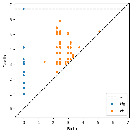
From the persistance diagram, we see several instances of H1 or one-cycles. The perisistance of these cycles indicate a robust and clear loop in our simplicial complex. Remember that the simplicial complex is imposed on our data and is a function of our data cloud as well as a parameter that we increase over time. These instances of ‘loops’ in our data are most likely due to the gradient nature of our image. The similar concentric bands of rgb valued pixels form concentric rings of sorts.
The information depicted in a persistance diagram is useful for detecting any relevant geometric features in our raw data. However, to leverage our data for use in constructing models, it is advised to transfrom our data into another form. This is where the notion of a persistance image applies. Broadly speaking, a persistance image takes our persistance diagram and transforms it into a vector form. This vector is represented by a pixel image with each pixel representing our persistance cycles. Each type of cycle is given a weight, and then the image takes these weights into account by highlighting the higher weighted pesistance cycles. Thus, a persistance image conveys similar information to a persistance diagram, and also renders the information of the diagram into a useful format for applying models and ml algorithms. We compute a persistance image using the persim package.
pim = PersImage(pixels=[50, 50], spread=1)
img = pim.transform(dgms[1])
pim.show(img)
For more information on how to apply persistance images using machine learning techniques, refer to the persim documentation website at https://persim.scikit-tda.org/.
For more details see GitHub Flavored Markdown.